Choosing the right paint colors for your home involves far more than picking a hue that looks good on a swatch. It’s about crafting an environment that feels harmonious, functional, and aligned with the purpose of each space. From calming bedrooms to energizing kitchens, color psychology plays a crucial role in how we experience our homes. For luxury residences like those found in The Colony at White Pine Canyon, the use of color becomes an even more important design element—highlighting architectural features, maximizing natural light, and enhancing the unique character of mountain living. Understanding the science behind color can lead to more intentional and impactful interior design.
Understanding the Psychology Behind Color
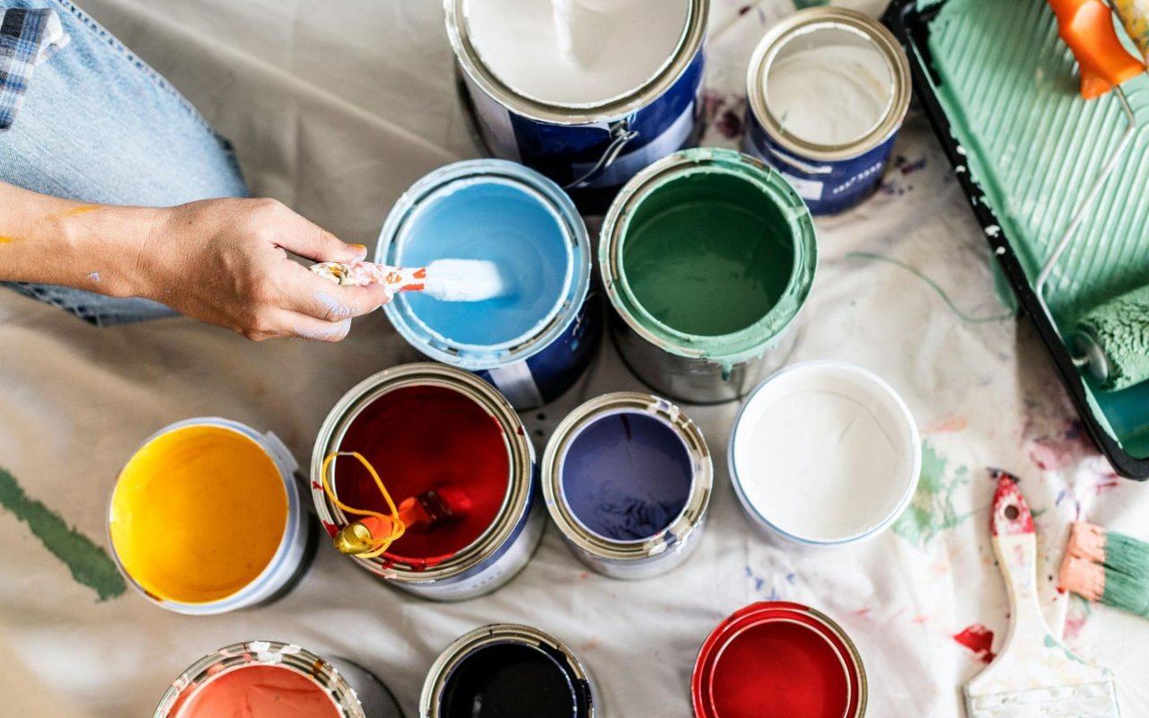
Each color triggers a different emotional response, and being aware of this can help guide the selection process. Warm colors like red, orange, and yellow tend to stimulate and energize. They are ideal for social areas such as dining rooms or game rooms. Cool colors like blue, green, and soft purples promote relaxation and are better suited for bedrooms, bathrooms, or reading nooks. Neutrals—like gray, beige, and soft whites—serve as calming backdrops that allow furniture and textures to take center stage, often used in main living spaces or open-concept layouts.
In high-end homes, color psychology is often used not just to influence mood but to subtly guide movement and function throughout the space. A bold, darker hue might be used in a wine cellar to evoke intimacy, while a pale, reflective shade enhances the spaciousness of a great room with vaulted ceilings.
In high-end homes, color psychology is often used not just to influence mood but to subtly guide movement and function throughout the space. A bold, darker hue might be used in a wine cellar to evoke intimacy, while a pale, reflective shade enhances the spaciousness of a great room with vaulted ceilings.
The Importance of Natural and Artificial Lighting
Light transforms color. A tone that looks cool and soft in a room flooded with daylight may appear dull or overly stark under artificial lighting. It’s important to test paint samples in different areas of the room and observe how the light changes throughout the day. Northern light tends to bring out cooler undertones, while southern light enhances warmth.
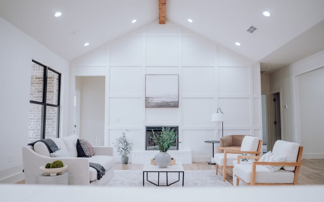
In The Colony at White Pine Canyon, where panoramic windows and natural surroundings dominate the home’s character, color must complement—not compete with—the landscape. Earth tones like moss green, stone gray, or soft ochre often harmonize well with views of pine forests and snow-covered terrain. In rooms with less light, using a warm neutral or pastel can help prevent the space from feeling cold or shadowed.
In The Colony at White Pine Canyon, where panoramic windows and natural surroundings dominate the home’s character, color must complement—not compete with—the landscape. Earth tones like moss green, stone gray, or soft ochre often harmonize well with views of pine forests and snow-covered terrain. In rooms with less light, using a warm neutral or pastel can help prevent the space from feeling cold or shadowed.
Color Harmony Throughout the Home
Luxury homes benefit from a cohesive color palette that flows naturally from one room to another. While each room may have its own mood or theme, a consistent undertone—be it warm or cool—creates visual continuity. This is especially true in open-concept homes or those with large, interconnected spaces.
One effective approach is to select a primary neutral base color and then layer accent tones that complement it. For example, soft ivory walls can serve as a canvas for a navy accent wall in the study or blush-toned accessories in a guest room. Maintaining this sense of harmony prevents clashing and allows the home to feel thoughtfully curated.
One effective approach is to select a primary neutral base color and then layer accent tones that complement it. For example, soft ivory walls can serve as a canvas for a navy accent wall in the study or blush-toned accessories in a guest room. Maintaining this sense of harmony prevents clashing and allows the home to feel thoughtfully curated.
Choosing Colors by Room Function
The purpose of a room should heavily influence the color scheme. In kitchens, warmer tones like creamy whites, sage green, or even dusty blue can stimulate the appetite and conversation while remaining timeless. Bathrooms often benefit from spa-like palettes—think soft grays, sand, or pale aqua—that promote a clean, serene feeling.
Bedrooms, as the most personal spaces in a home, are where muted colors typically shine. Soft lavenders, smoky blues, or warm taupes create a calming effect conducive to sleep and privacy. Meanwhile, formal dining rooms or home libraries may accommodate deeper, moodier colors like merlot, charcoal, or forest green to evoke richness and depth.
For flex rooms—spaces that serve multiple functions—it’s best to keep the base color light and neutral, then use interchangeable décor elements like rugs, curtains, or artwork to personalize and adapt the space over time.
Highlighting Architectural Details Through Color
Color can also be a strategic tool to highlight the architecture and craftsmanship of a home. Painted millwork, accent walls, coffered ceilings, and built-ins all present opportunities to add contrast or emphasis. A darker hue inside a recessed bookshelf, for example, can add depth and sophistication without overwhelming the room.
In mountain homes like those in The Colony at White Pine Canyon, where wood beams, stone fireplaces, and expansive windows are often key design elements, the right paint color can enhance the natural materials. Using a slightly warmer or cooler paint on surrounding walls can help these features pop without creating visual dissonance.
In mountain homes like those in The Colony at White Pine Canyon, where wood beams, stone fireplaces, and expansive windows are often key design elements, the right paint color can enhance the natural materials. Using a slightly warmer or cooler paint on surrounding walls can help these features pop without creating visual dissonance.
Don’t Overlook Finishes and Textures
The sheen or finish of paint also impacts how color appears. Matte and flat finishes absorb more light, offering a soft, understated effect—ideal for walls in bedrooms or formal dining rooms. Satin and eggshell provide a slight sheen and are more durable, making them perfect for high-traffic areas like hallways or kitchens. Gloss and semi-gloss finishes are best for trim, doors, and cabinetry, where durability and light reflection are desired.
Additionally, textured walls, plaster, or paneling can influence how color distributes across a surface. Homes with unique architectural textures might benefit from monochromatic schemes that allow shadow play to enhance depth and dimension subtly.
Additionally, textured walls, plaster, or paneling can influence how color distributes across a surface. Homes with unique architectural textures might benefit from monochromatic schemes that allow shadow play to enhance depth and dimension subtly.
A Carefully Curated Home
The perfect color scheme doesn’t follow trends blindly—it responds to the home’s natural light, layout, materials, and the personality of its residents. Choosing colors that reflect the lifestyle and design goals of the homeowner ensures that each space feels intentional and beautiful.
In a home market like The Colony at White Pine Canyon, where architectural artistry meets the natural environment, using color strategically adds not just style but value. From first impressions in the entryway to personal retreat in the master suite, the right tones elevate both everyday living and resale appeal.
In a home market like The Colony at White Pine Canyon, where architectural artistry meets the natural environment, using color strategically adds not just style but value. From first impressions in the entryway to personal retreat in the master suite, the right tones elevate both everyday living and resale appeal.
A Thoughtful Approach to Color Starts Here
Homeowners preparing to elevate or personalize a luxury residence should consider how much impact thoughtful color choices can have. Whether staging for sale or creating a sanctuary for years to come, color is a tool that shapes the perception and experience of a home.
For those seeking guidance on luxury properties in Park City and The Colony at White Pine Canyon, Marcus Wood offers local expertise and a refined understanding of what today’s buyers and homeowners value most. Reach out today for expert insights on homes for sale and how to present yours at its very best.
For those seeking guidance on luxury properties in Park City and The Colony at White Pine Canyon, Marcus Wood offers local expertise and a refined understanding of what today’s buyers and homeowners value most. Reach out today for expert insights on homes for sale and how to present yours at its very best.